CSS Pseudo-Classes
CSS pseudo-classes are used to style HTML elements based on their current state, position, or user interaction.
What is a CSS Pseudo-Class?
A pseudo-class is a special keyword added to a CSS selector to style an element when a particular condition is true.
For example, you can change a button's appearance when the user moves the mouse over it, focuses it with the keyboard, or selects a checkbox.
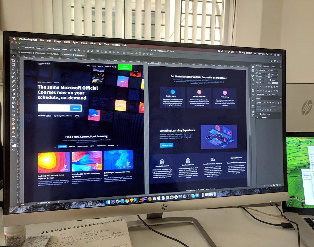
Pseudo-classes are commonly used to create interactive states in modern web interfaces.
Pseudo-Class Syntax
selector:pseudo-class {
    property: value;
}
Simple Explanation
The colon : is used before the pseudo-class.
The CSS rule is applied when that pseudo-class condition
is active.
How Pseudo-Classes Work
1. :hover
The :hover pseudo-class applies styles when
the mouse pointer is positioned over an element.
.hover-button {
    background-color: #2563eb;
    color: #ffffff;
}

.hover-button:hover {
    background-color: #7c3aed;
}
Output
Move your mouse over the button to see the color change.
2. :focus
The :focus pseudo-class applies styles when
an element receives focus, for example when a user clicks
an input field or reaches it using the keyboard.
.focus-input {
    border: 2px solid #ced4da;
    padding: 10px;
}

.focus-input:focus {
    border-color: #2563eb;
    outline: none;
}
Output
Click inside the input to see the focus style.
3. :active
The :active pseudo-class applies while an
element is being activated, such as while a button is
being pressed.
.active-button {
    background-color: #0f766e;
    color: #ffffff;
}

.active-button:active {
    background-color: #be123c;
}
4. :first-child
The :first-child pseudo-class targets an
element when it is the first child of its parent.
.student-list li:first-child {
    color: #2563eb;
    font-weight: 700;
}
Output
- Rahul
- Priya
- Amit
- Neha
5. :last-child
The :last-child pseudo-class targets the last
child element inside its parent.
.course-list li:last-child {
    color: #7c3aed;
    font-weight: 700;
}
6. :nth-child()
The :nth-child() pseudo-class allows you to
target an element based on its position.
.number-list li:nth-child(2) {
    color: #0f766e;
    font-weight: 700;
}
Output
- HTML
- CSS
- JavaScript
- C#
7. :checked
The :checked pseudo-class targets checkbox
or radio input elements when they are selected.
.course-checkbox:checked {
    accent-color: #2563eb;
}
Output
8. :disabled
The :disabled pseudo-class styles an element
when it is disabled.
.disabled-button:disabled {
    background-color: #adb5bd;
    color: #ffffff;
    cursor: not-allowed;
}
9. Common Link Pseudo-Classes
| Pseudo-Class | Purpose |
|---|---|
:link |
Styles an unvisited link |
:visited |
Styles a visited link |
:hover |
Styles an element when the pointer is over it |
:active |
Styles an element while it is being activated |
:focus |
Styles an element when it has focus |
Combined Example
Multiple pseudo-classes can be used to create a more interactive component.
.course-button {
    background-color: #2563eb;
    color: #ffffff;
    border: 0;
    padding: 12px 20px;
    border-radius: 6px;
}

.course-button:hover {
    background-color: #7c3aed;
}

.course-button:active {
    background-color: #0f766e;
}

.course-button:focus {
    outline: 3px solid #bfdbfe;
}
Output
Try hovering, clicking, and focusing the button.
Common CSS Pseudo-Classes
:hover
Mouse interaction
:focus
Keyboard or input focus
:active
Active interaction
:first-child
First child element
:last-child
Last child element
:nth-child()
Specific child position
:checked
Selected form control
:disabled
Disabled element
Best Practices
- Use pseudo-classes to improve user interaction.
- Provide clear visual feedback for hover and focus states.
- Do not rely only on color to communicate important states.
- Make sure keyboard users can clearly see focused elements.
- Use structural pseudo-classes when they simplify your CSS.
Important Note
Pseudo-classes do not create new HTML elements. They simply allow CSS to target an element when a particular state or condition is true.
Summary
CSS pseudo-classes are special selectors used to style
elements based on interaction, state, or position.
Common examples include :hover,
:focus, :active,
:first-child, :last-child,
:nth-child(), :checked,
and :disabled.