Mobile First
Mobile First is a responsive design approach where you design the website for smaller screens first and then enhance the layout for larger screens.
What is Mobile First?
In a Mobile First approach, the default CSS is written for mobile devices. Additional styles are then added using media queries for tablets, laptops, and desktops.
The main idea is to first create a clean and usable layout for small screens and then progressively improve the design for larger screens.
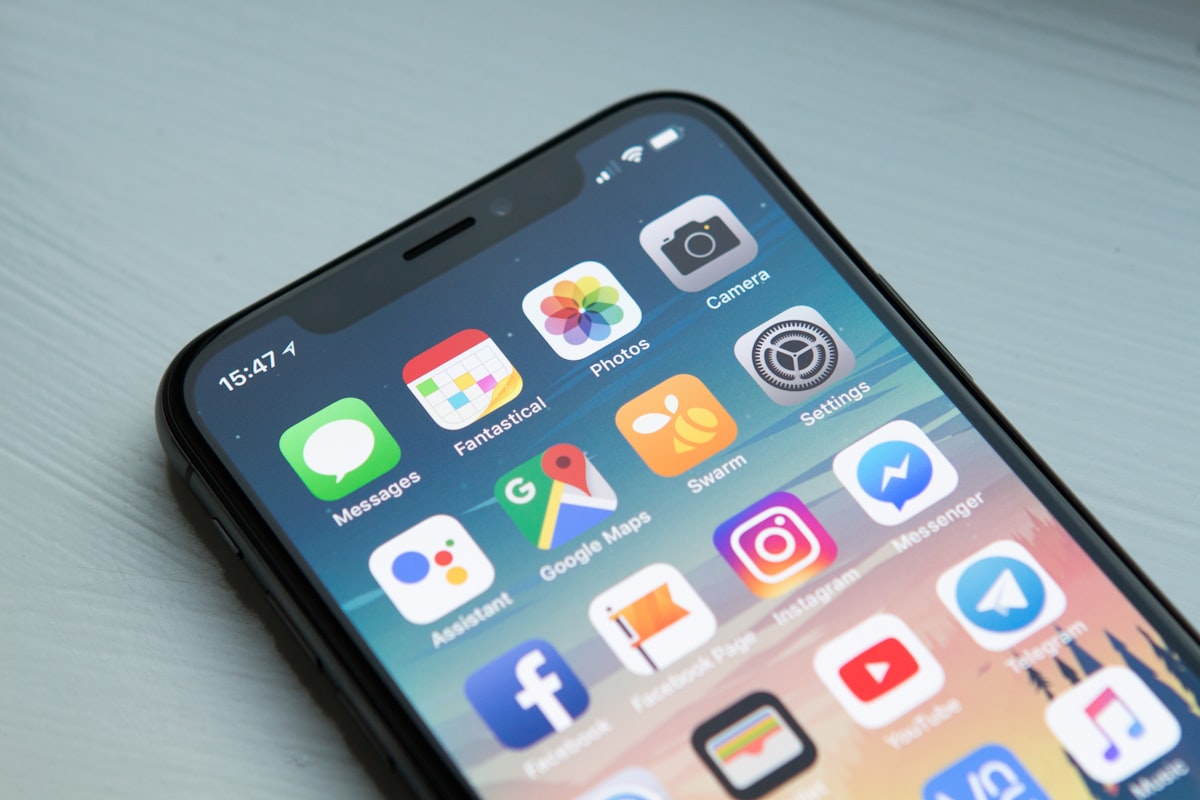
Mobile First design starts with smaller screens and progressively adapts the layout for larger screens.
Mobile First Approach
Simple Explanation
Imagine you are designing a website for a mobile phone. You first create the basic layout for the small screen.
Then, when the screen becomes wider, you add extra styles to use the available space more effectively.
Mobile First Syntax
.container {
    width: 100%;
    padding: 15px;
}

@media (min-width: 768px) {

    .container {
        max-width: 720px;
    }
}

@media (min-width: 992px) {

    .container {
        max-width: 960px;
    }
}
Base CSS
The first set of styles applies to all screen sizes, especially small screens.
Tablet Styles
At 768px and above, additional styles
are applied for larger screens.
Desktop Styles
At 992px and above, the container becomes
wider for desktop screens.
Example: Mobile First Card Layout
The following example starts with one column for mobile. At larger screen sizes, more columns are added.
.mobile-first-grid {
    display: grid;
    grid-template-columns: 1fr;
    gap: 15px;
}

.mobile-first-card {
    background-color: #2563eb;
    color: white;
    padding: 25px;
    text-align: center;
    border-radius: 8px;
}

@media (min-width: 768px) {

    .mobile-first-grid {
        grid-template-columns: repeat(2, 1fr);
    }

    .mobile-first-card {
        background-color: #7c3aed;
    }
}

@media (min-width: 992px) {

    .mobile-first-grid {
        grid-template-columns: repeat(4, 1fr);
    }

    .mobile-first-card {
        background-color: #0f766e;
    }
}
Output
Resize the browser window to observe the Mobile First layout changing at different screen widths.
How This Example Works
Mobile: Below 768px
The default CSS creates
1 column.
The card background color is
#2563eb.
Tablet: 768px and Above
The grid changes to
2 columns
and the card background color becomes
#7c3aed.
Desktop: 992px and Above
The grid changes to
4 columns
and the card background color becomes
#0f766e.
Mobile First vs Desktop First
| Mobile First | Desktop First |
|---|---|
| Starts with small screens | Starts with large screens |
Uses min-width frequently |
Uses max-width frequently |
| Progressively enhances the layout | Progressively reduces the layout |
| Useful for responsive design | Can be useful for desktop-focused layouts |
Why Use Mobile First?
- Mobile screens have limited space, so important content is designed first.
- It encourages simpler and cleaner layouts.
- Larger screens can progressively receive additional layout features.
- It works naturally with responsive grid and flex layouts.
Common Mobile First Media Queries
@media (min-width: 576px) {
    /* Small devices */
}

@media (min-width: 768px) {
    /* Tablets */
}

@media (min-width: 992px) {
    /* Desktops */
}

@media (min-width: 1200px) {
    /* Large desktops */
}
Important Note
Mobile First does not mean that the website is only designed for mobile devices. It means the base design starts with the smallest practical screen size and additional styles are added for larger screens.
Real-World Uses
- Responsive websites
- E-commerce websites
- Training institute websites
- News and content websites
- Responsive dashboards
- Portfolio websites
Summary
Mobile First is a responsive design strategy where the
base CSS is created for smaller screens first.
Media queries using min-width are then used
to add styles for tablets, desktops, and larger screens.